Scroll Down
At a Glance
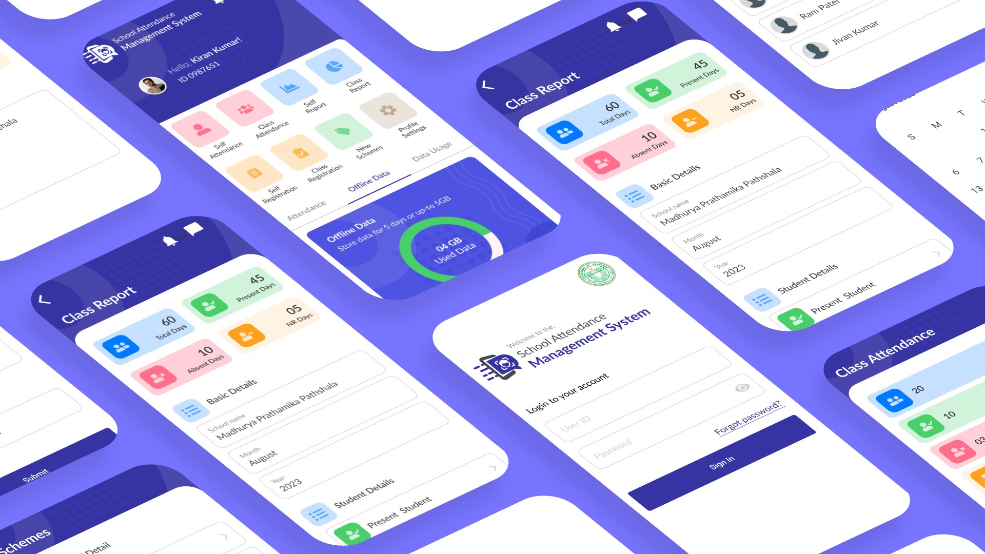
I worked as a UI UX Designer on the Telangana government school’s attendance management app for over four months throughout 2023. I worked to design the mobile app for attendance system to tailor the user experience to school teacher’s self, class attendance through 2 rounds of wireframing, prototyping, and testing. In 3 months, I delivered a complete set of mobile app design, a detailed design system, and worked with the app developers to bring the design to life.
Timeline
20 Weeks
My Role
UI UX Designer
Team Lead
Collaboration
1 Manager
1 Business Analyst
1 Team of SWE's
Platform
Figma
Miro
Notion
Photoshop
Illustrator
Client’s Need
To understand the users, I carefully read through all the client documents and previous attendance process. I initiated 2 meetings with the PM, BA to clarify the user situations and the user problem. The PM, BA did not plan to conduct another round of user research or user testing, so I worked within the constraint and mad full use of existing resources. I incorporated the insights into the user persona named Emily Thompson.
Problem
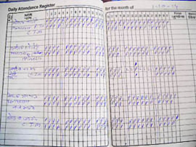
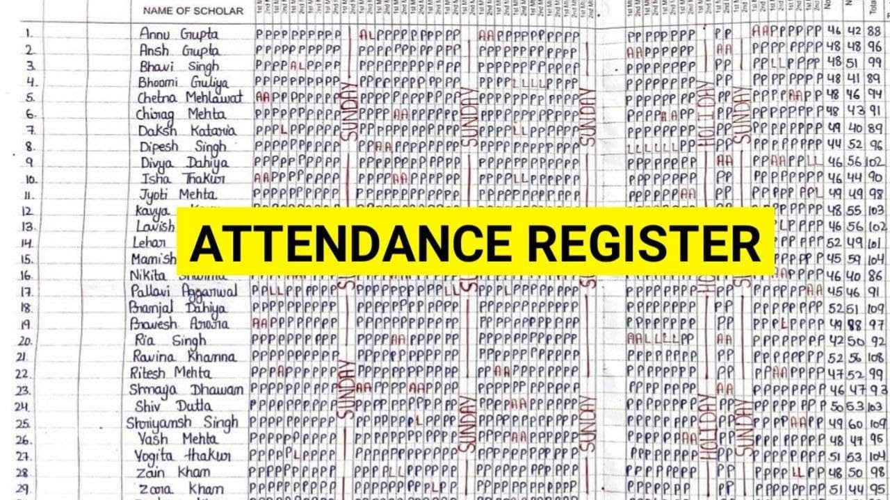
Telangana Government school’s physical attendance register has the following problems:
Outdated register design
Unclear hierarchy
Physical draw the month-wise, day-wise column
Write each student's name for every month
Day-to-day ask for present, absent, new student
End of the month generate an attendance report on paper
Distribute the school assets (uniform, meals, books) and maintain the paper records
Solution
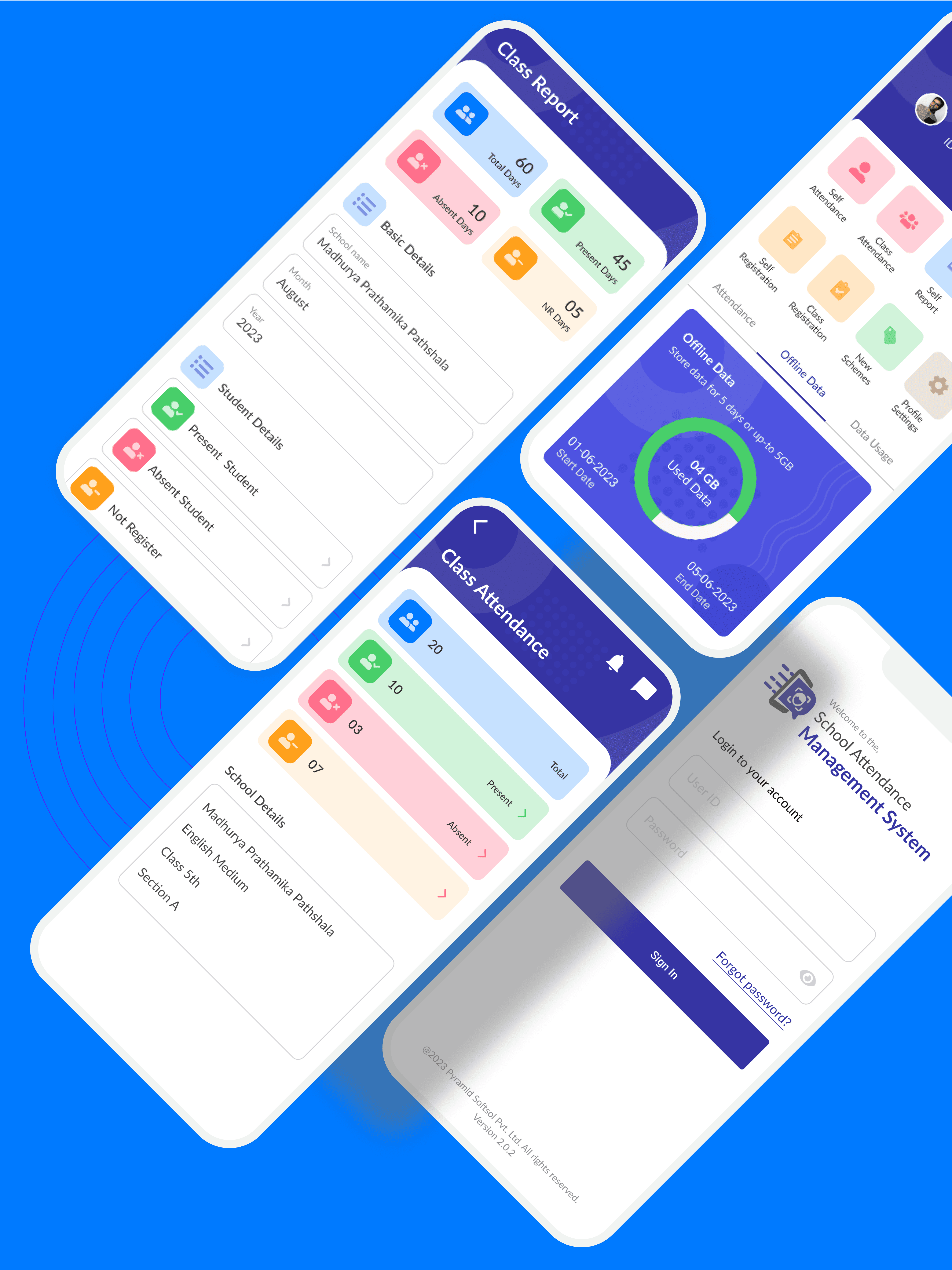
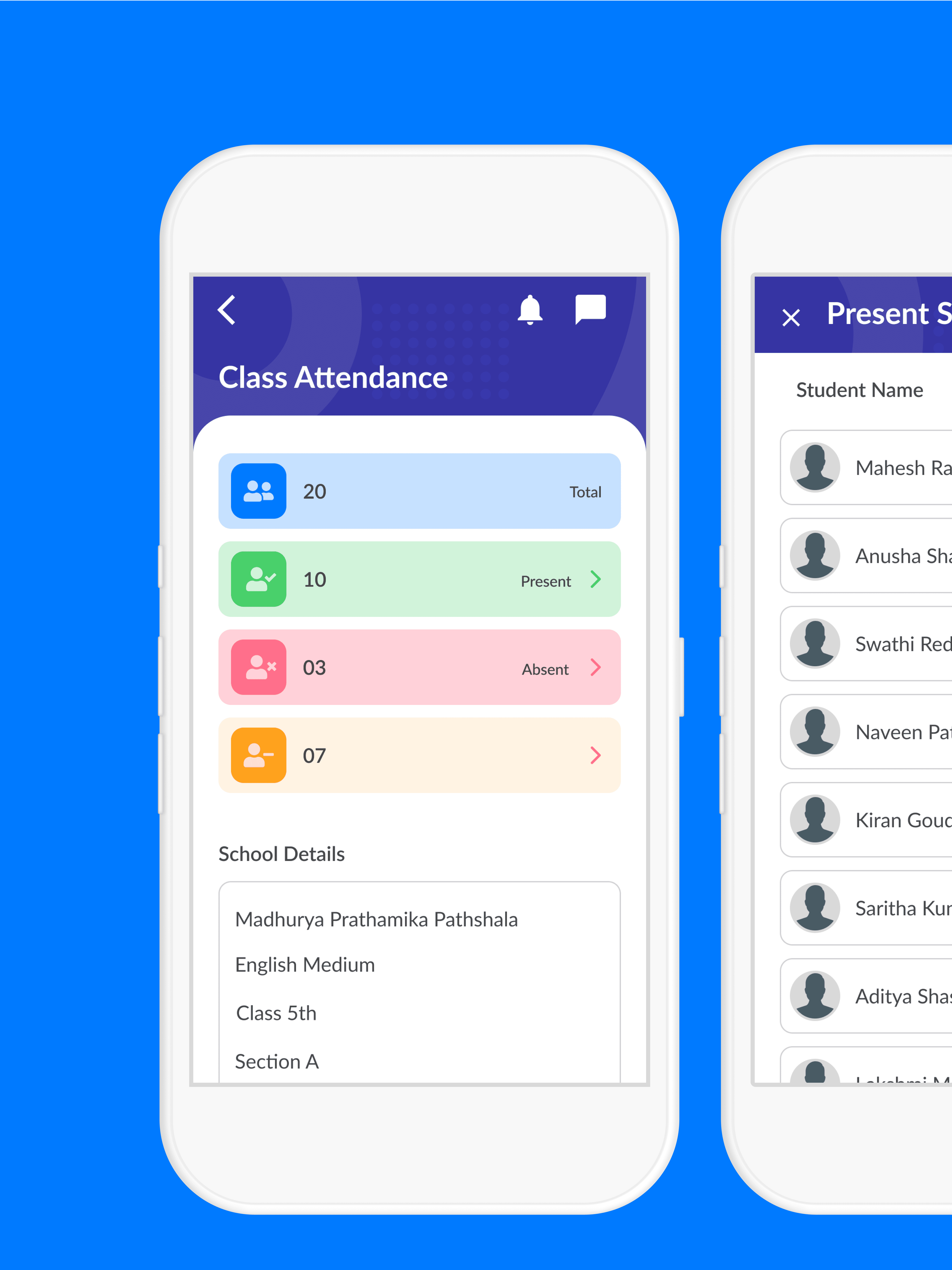
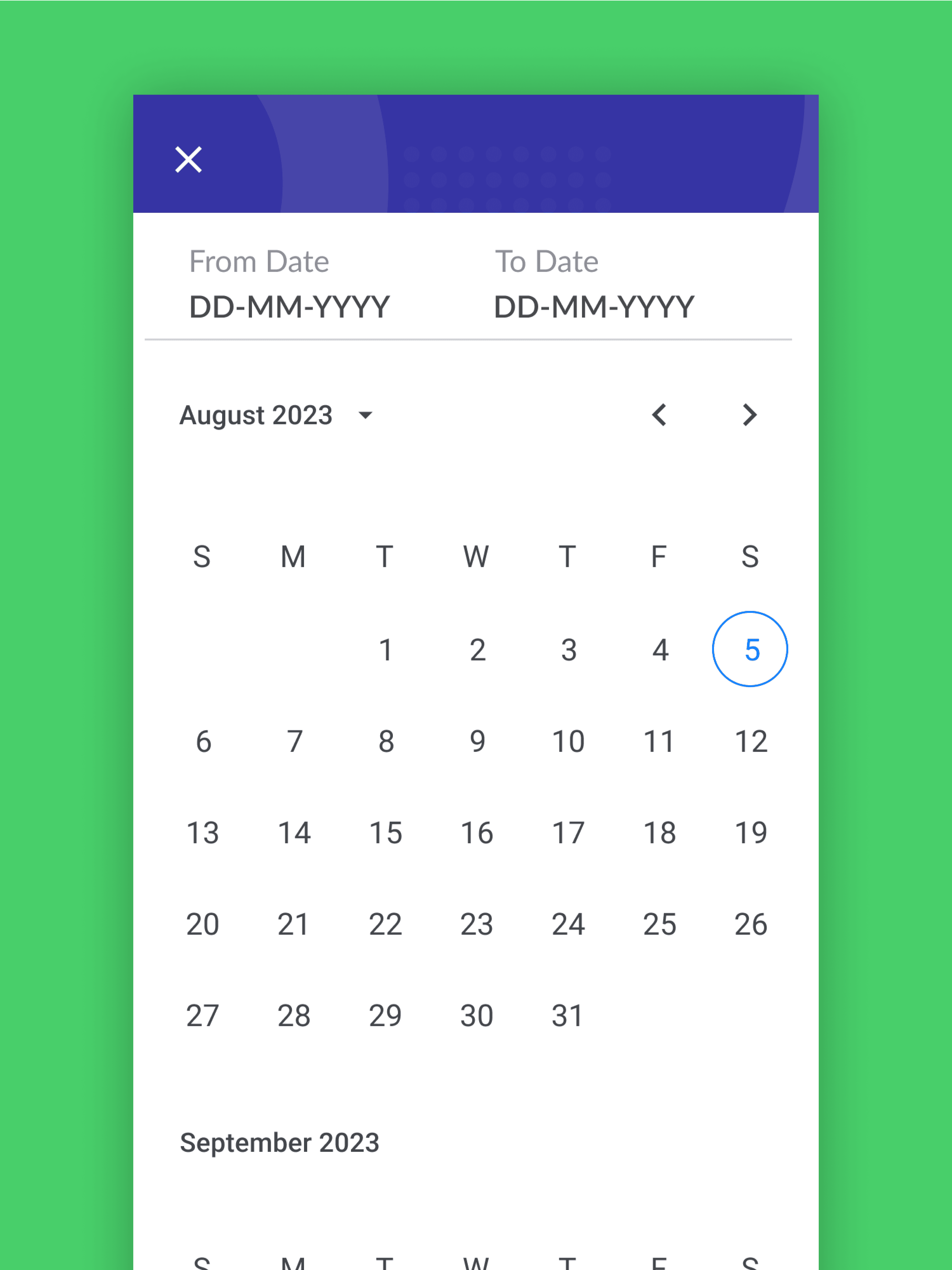
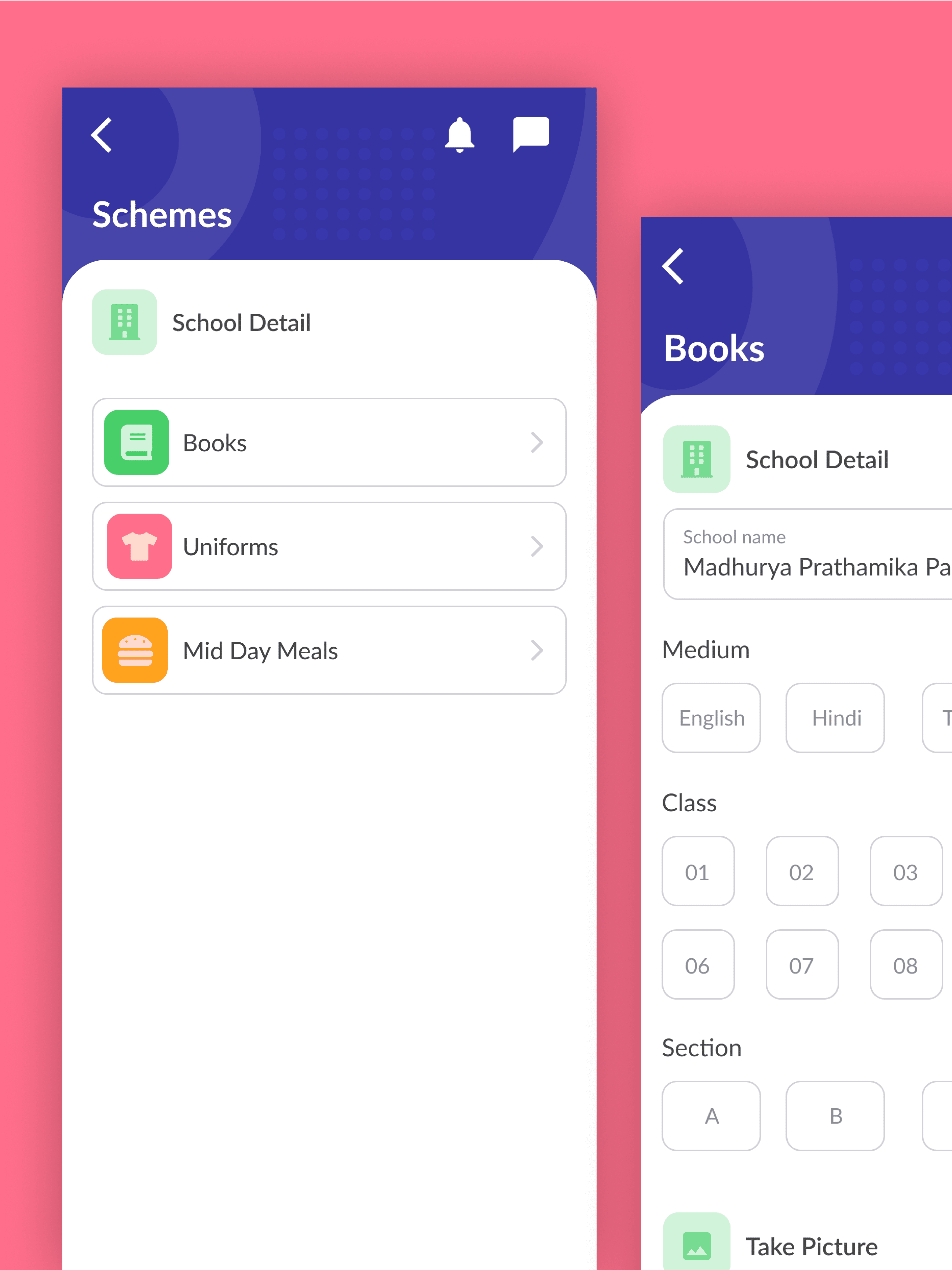
I designed the mobile app so that it has a clear hierarchy and a simple user flow for teachers, school admins. Instead of laying out the all the features, I highlighted the 6 key features: Self, Class attendance, reports, register new student. I focused on the Android device only as per the find research that most of the teachers using the same OS based devices.
Design Constraints
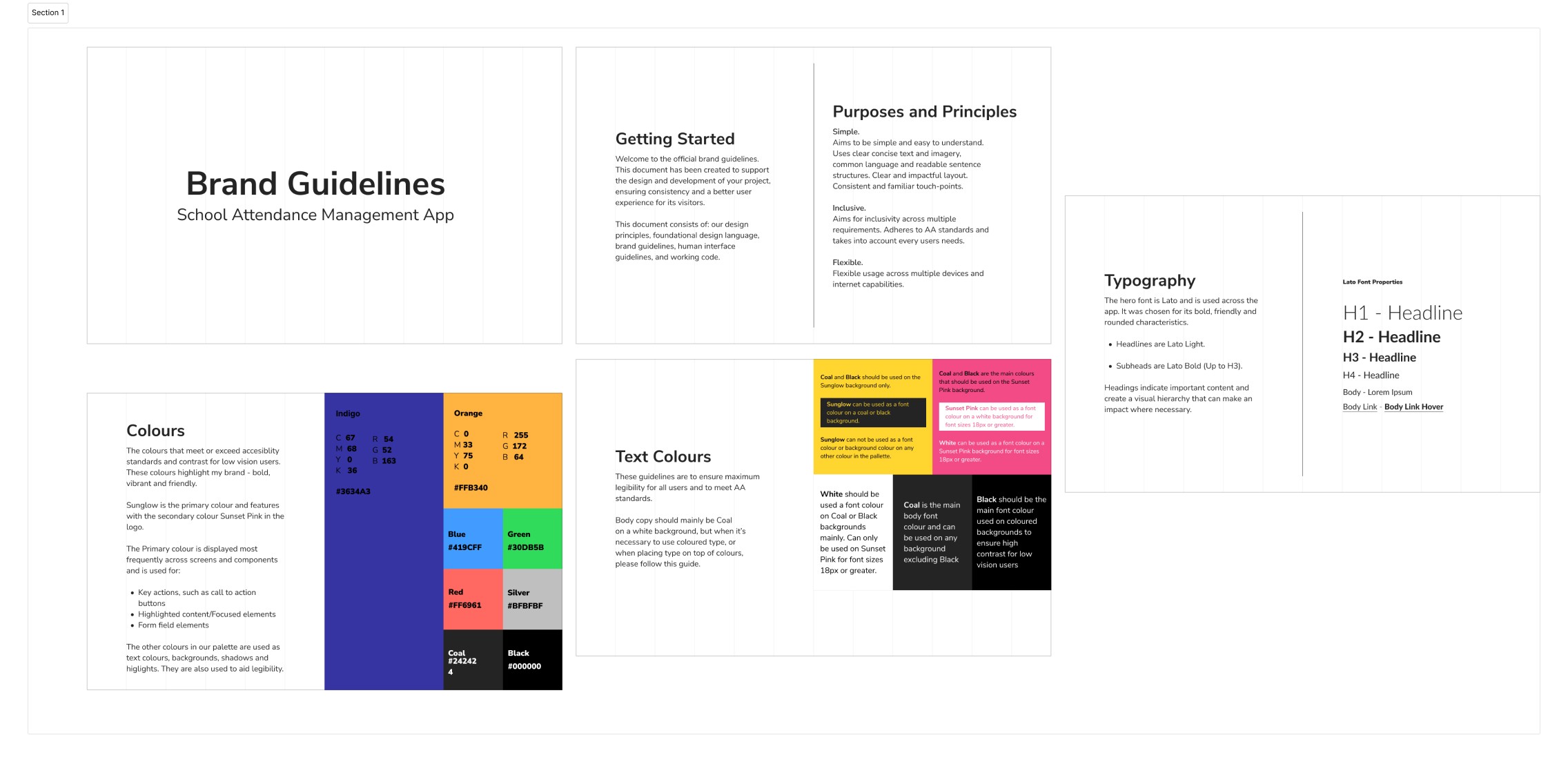
In the process of designing the TS Mobile App, various design constraints were taken into account. These included following brand guidelines for visual consistency, complying with accessibility standards for an inclusive interface, integrating with existing backend systems for seamless functionality, and prioritizing data security, which influenced the overall design choices. Despite these limitations, the design solutions were carefully crafted to provide an easy-to-use and intuitive experience while meeting essential technical and brand-related requirements.
Process
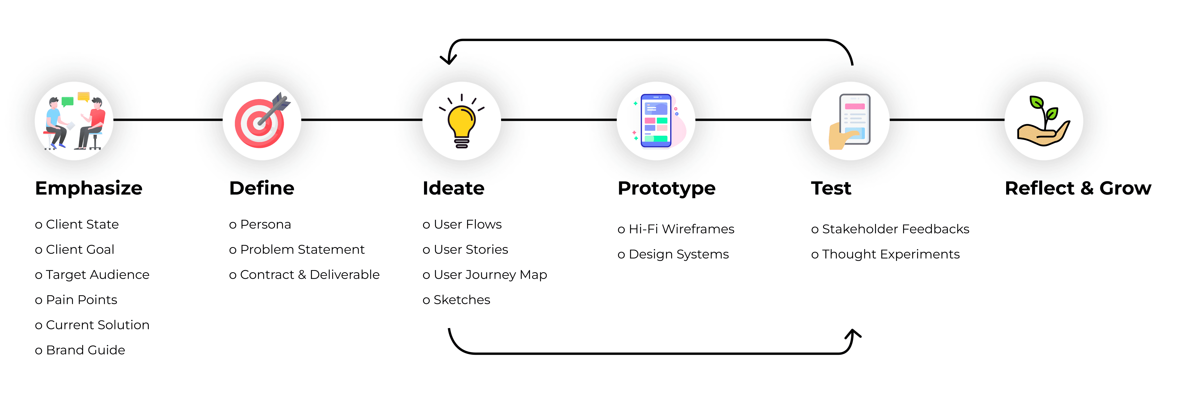
Mostly I follow the design thinking 5 steps for UI UX design.
User Persona
To understand the users, I carefully read through all the client documents and previous attendance process. I initiated 2 meetings with the PM, BA to clarify the user situations and the user problem. The PM, BA did not plan to conduct another round of user research or user testing, so I worked within the constraint and mad full use of existing resources. I incorporated the insights into the user persona named Emily Thompson.

Emily Thompson
35 years old
Hyderabad, India
D.Ed., M.Ed.
Teacher
Bio
Emily is a dedicated high school teacher with a passion for fostering student growth and learning. With six years of experience in the education field, she understands the importance of engaging, student-centered teaching methods.
Quote
“I wish there was an easier way to mark attendance and generate reports. It’s time-consuming and prone to errors. I want more time to focus on teaching and a system that simplifies the entire process.”
Goal
Streamline attendance management process
Ensure accurate and reliable attendance records
Needs
Automated attendance marking
Automated attendance report generation and assets distribution
Frustration
Time-consuming manual attendance tracking
Cumbersome administrative tasks
Technology
Proficient in using computers & mobile devices
Emily’s User Journey Map

Paper First
The process below begins with my initial idea’s wireframes, then moves to mockups, and finally to the high-fidelity prototype. In this simple version, you can see how the I approach solves the user needs. There are at most two major interaction areas per page to guide a user through the user flow they need.
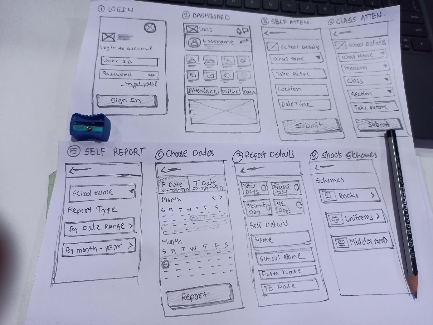
From Paper to Digital
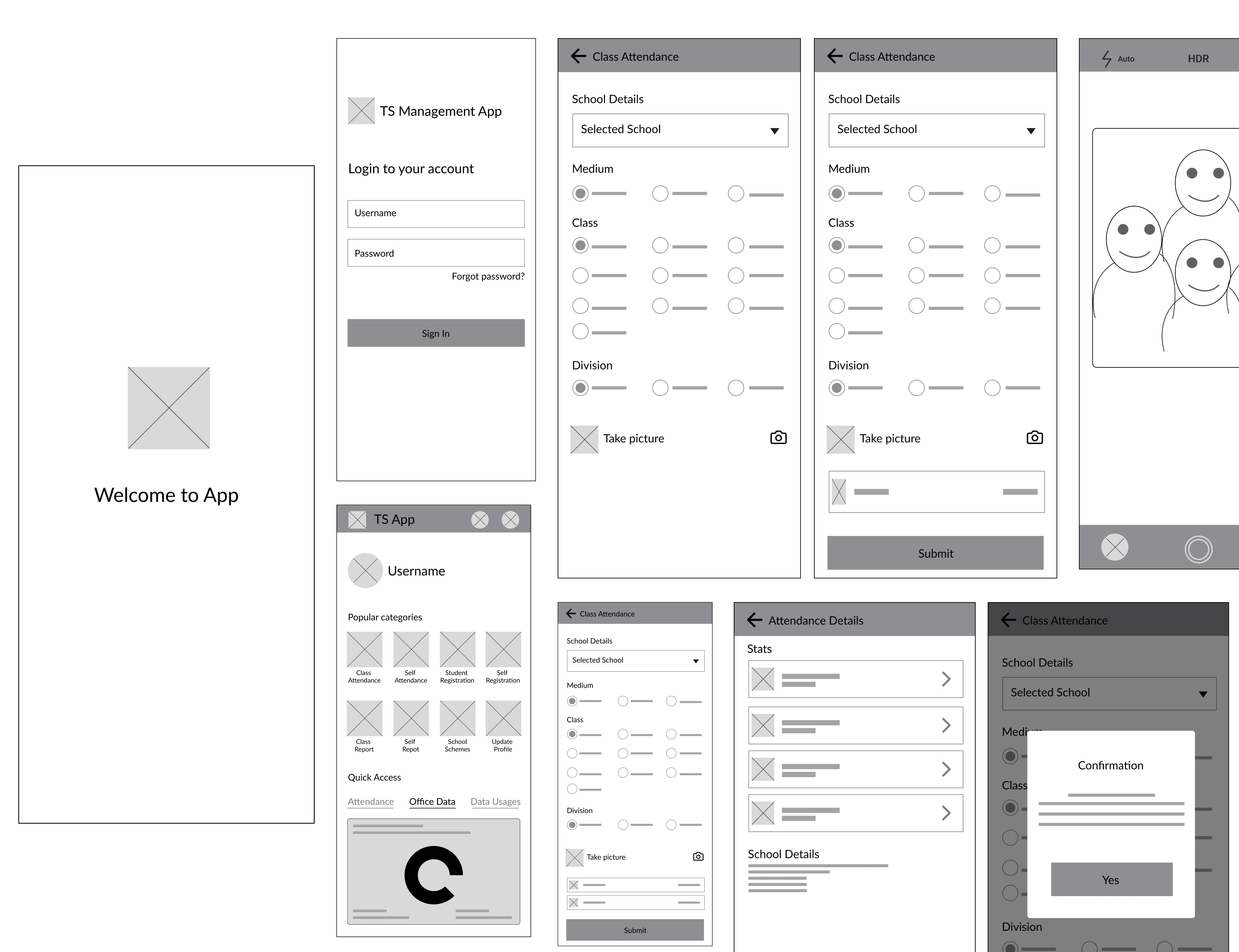
I then brought my idea to an interactive digital low-fidelity prototype and brought it the key stakeholders to collect feedbacks.Figma Wireframe
Userflow
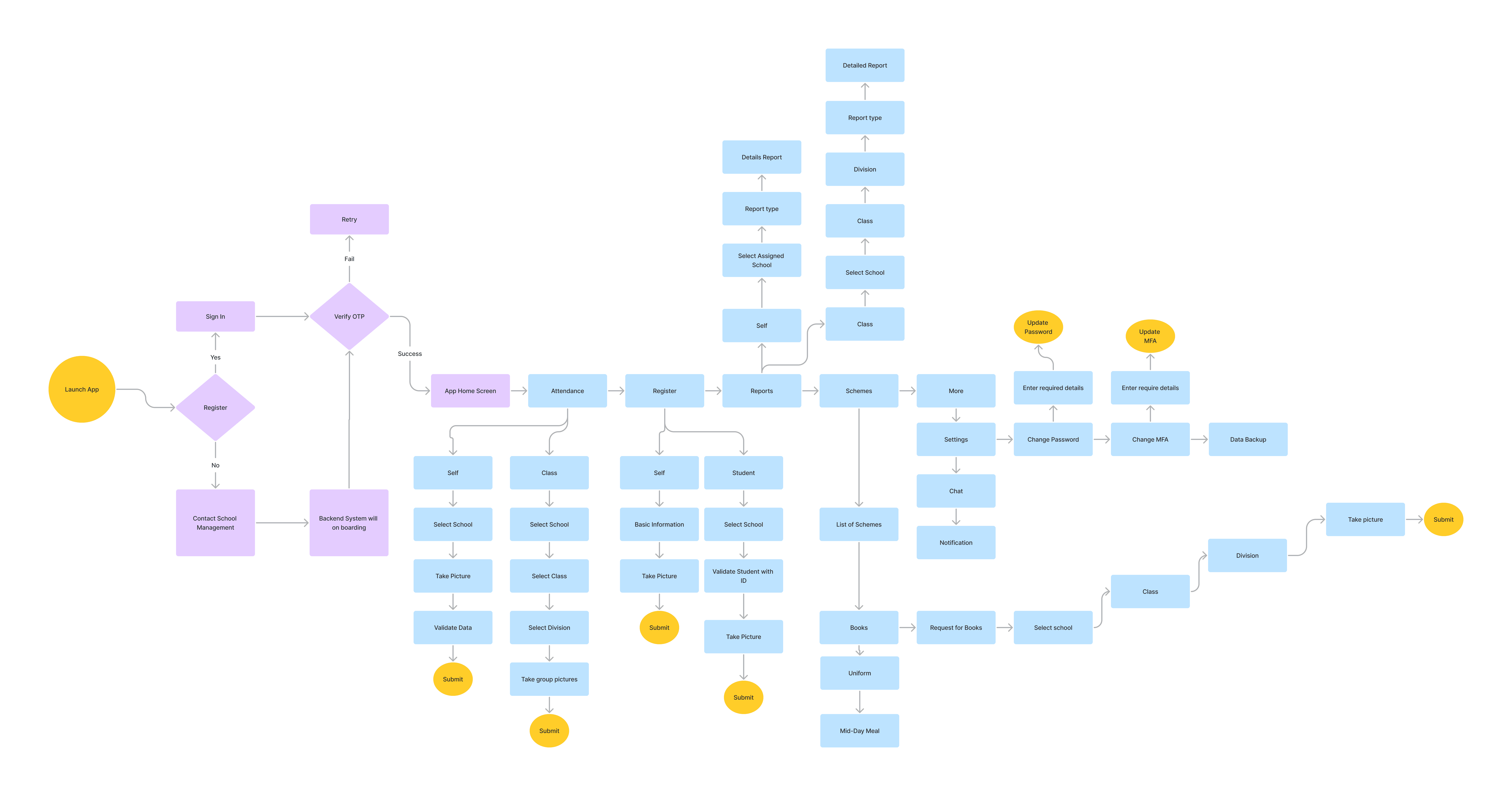
After getting some ideas on paper, I mapped out the user flow if Emily came to TS Mobile app. The user flow includes two major paths: one where Emily starts with a self-attendance and the other with Emily getting class attendance.
Design Systems
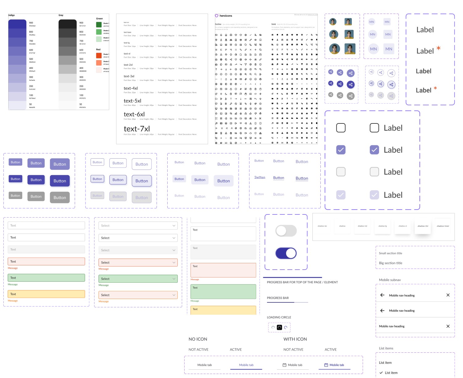
Basically, we followed Google Material design systems and created own design systems with our font family and color combination. Figma File
Design Iterations
Imporved Hierarchy
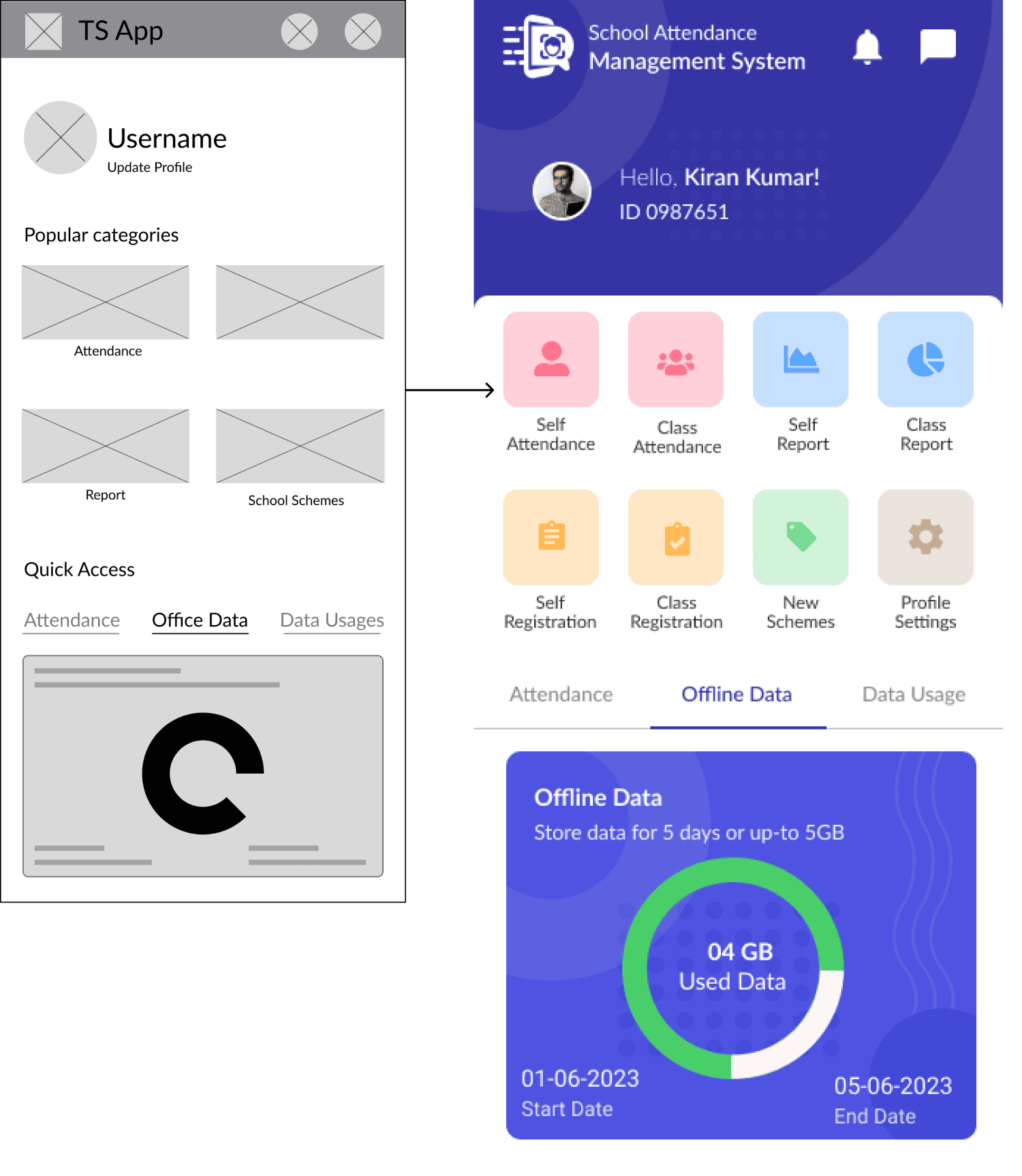
In the initial wireframes, a user can access major features through a multi-click from the home page. After I demonstrated the design to the product owner and team, I received feedback on reducing the multi-click from the home page element to highlight one key user flow. Based on our discussion, our team agreed that a user like Emily needs to see an attendance CTA as soon as possible. For this reason, I revised the user flow and added six major elements to the homepage at the top of the page so that users can quickly go through the one-by-one user flow.
Mockups
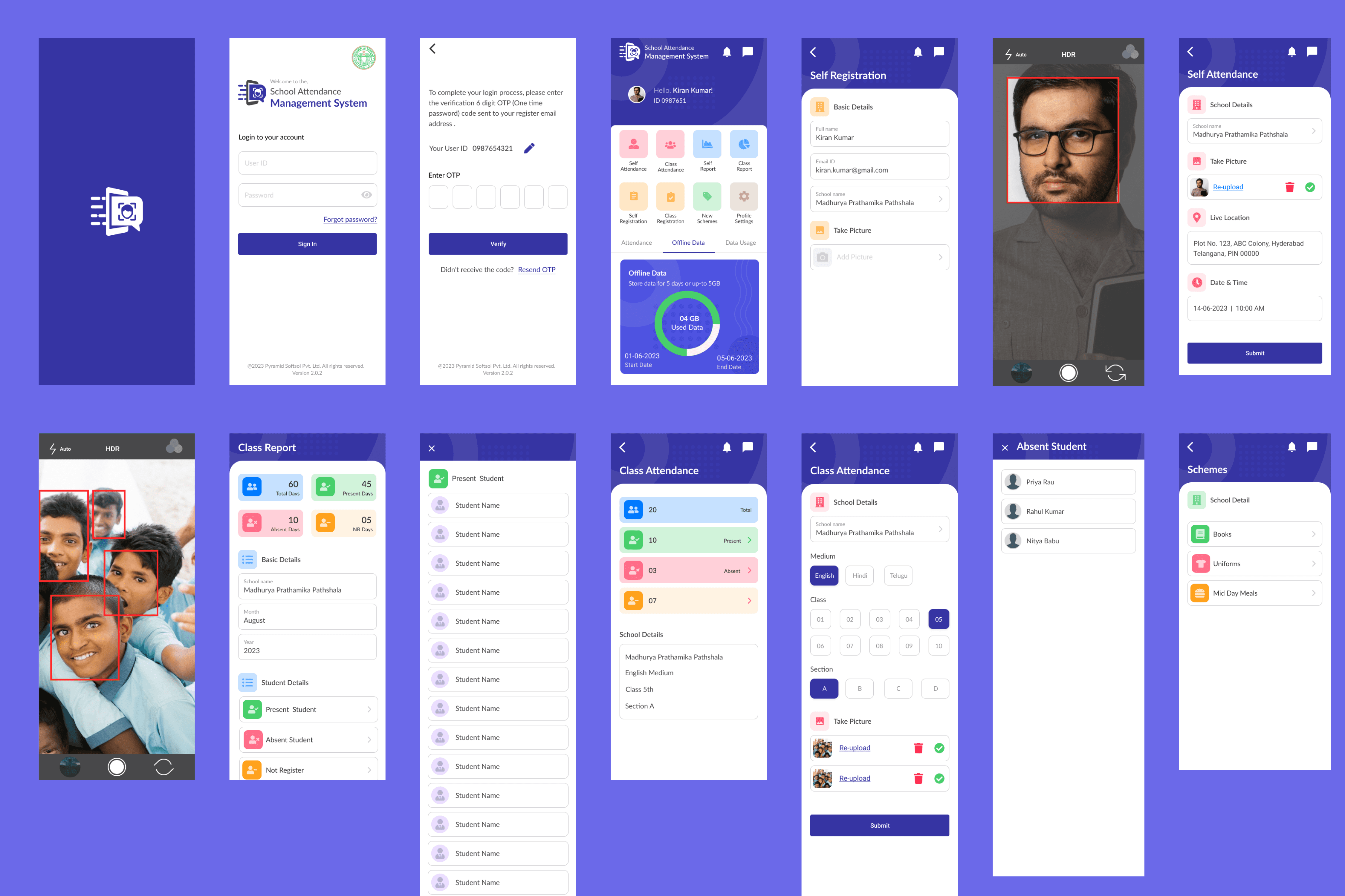
Basically, we followed Google Material design guidelines and created own mockupsMockup
What I Learned?
Throughout my time working with the TS app, I have learned the importance of using all the resources possible to work within the constraints. Having more direct user feedback would be ideal for my design situation, but when that's not available, I had to look for answers by communicating with project managers and looking at other companies solutions as a reference.
I also collaborated on a daily basis with project managers and business analysts working with the TS app. I have learned that not all designs can be easily implemented as code, so I developed a communication system that enables faster and better communication. I learned that without good communication with the team, a good design could hardly be delivered.
© Sagar Sutar 2023
sagar.webxperts@gmail.com
+91 8007102187